Dashboards
Overview Dashboard
The built-in Overview Dashboard provides a default selection of charts to visualize your fleet at a glance.
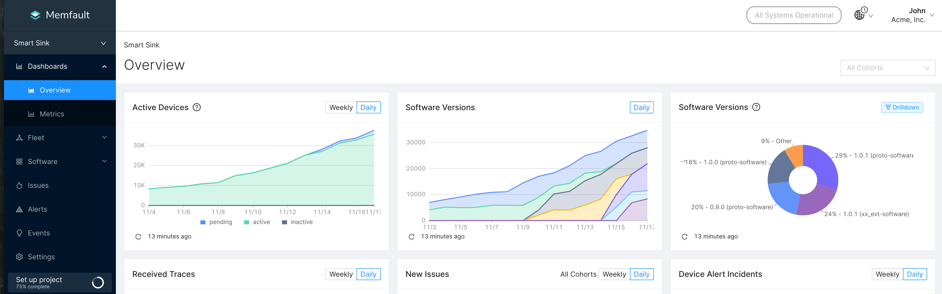
Active Devices and Software Versions in your fleet
If you edit or delete any charts in the Overview Dashboard, you can restore them
by clicking the Restore Default Dashboard button on the
All Dashboards page.
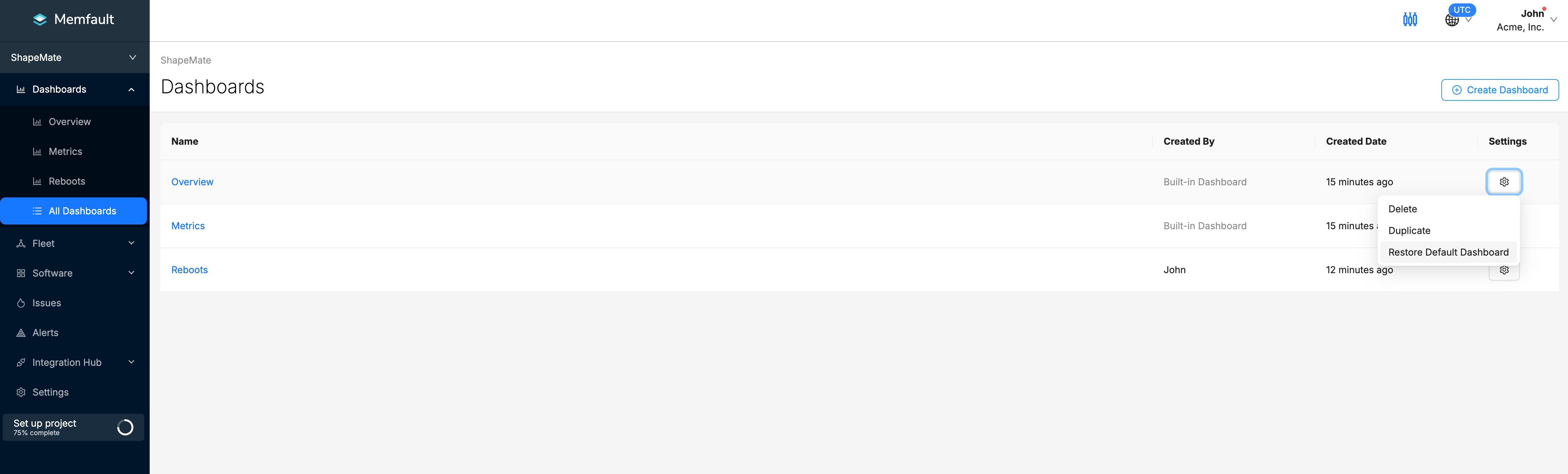
Configurable Dashboards
In addition to the built-in dashboards, you can also configure custom dashboards to visualize and group your data for other uses. For example, you can create separate dashboards for different teams to use or to monitor different device cohorts. Creating and managing dashboards is done on the All Dashboards page, located in the sidebar.
After creating a new dashboard, you can add custom charts to it. For more information on how to create charts, check out the Charts page.
Layout Mode
Rearrange charts on a dashboard with Layout Mode. To enter Layout Mode, click
the Layout Mode toggle on the top-right corner of the page.
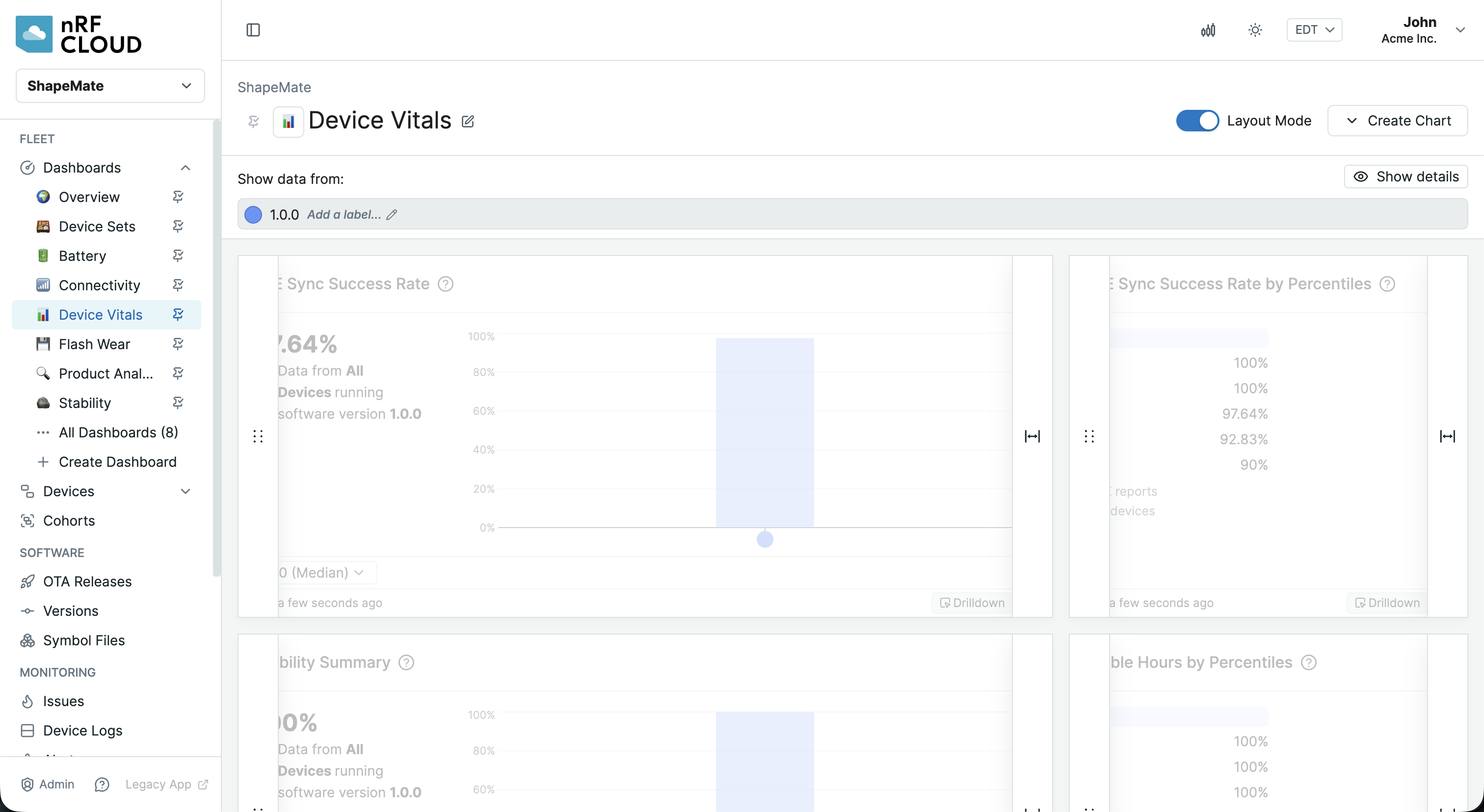
In Layout Mode, you can drag and drop the charts to move them. You can also
resize the charts by dragging the right corner of the chart. To exit Layout Mode
and save changes, click the Layout Mode toggle again.
Filtering Charts
Data in charts is filtered by the filter section at the top of each dashboard.
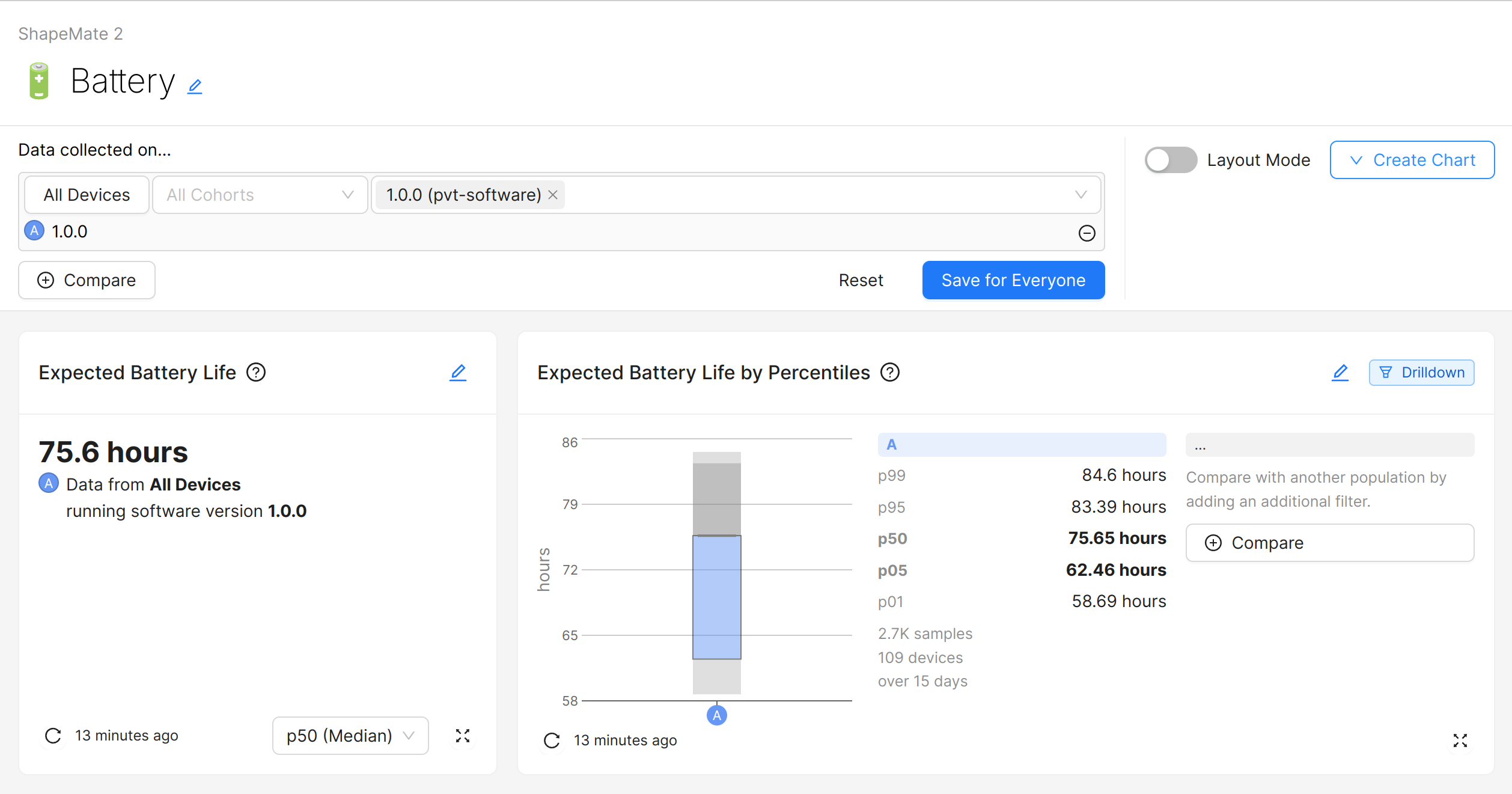
The available filters:
After adding or modifying filters, save them with the Save for Everyone
button, or restore the saved filters by clicking Reset.
Filtering by Devices
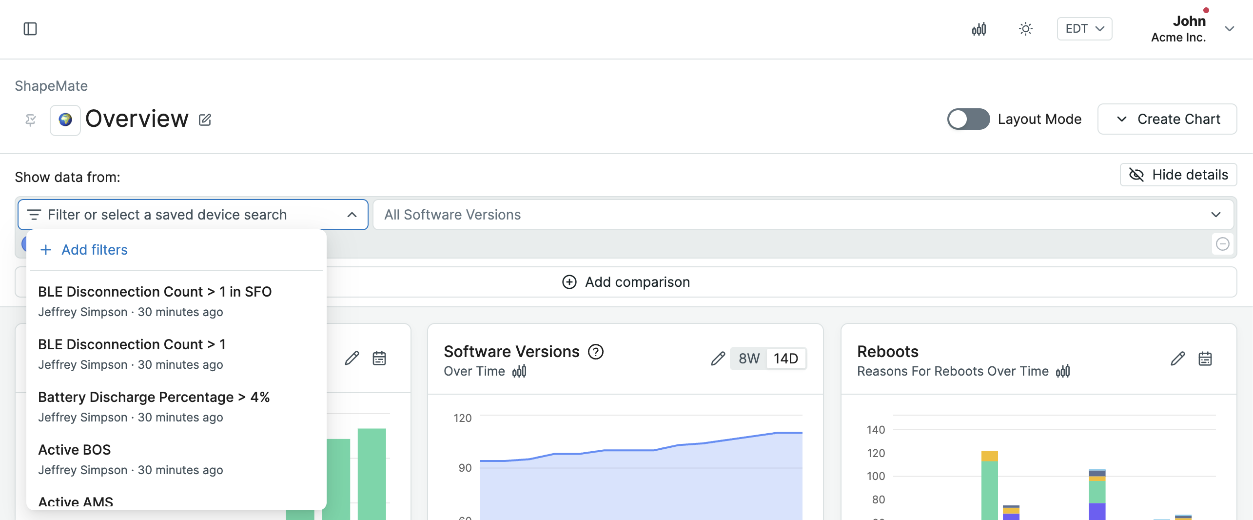
To filter the data by Devices, use the "Filter or select a saved device search" left-side dropdown:
- Select one of your Saved Device Searches to apply it as a filter.
- Click "Add filters" to select ad-hoc filters using the same options available on the Devices page.
Once a filter is applied, the dropdown will display the selected saved search or a summary of the active filters, along with the count of applicable devices.
Filtering by Devices applies to the list of Devices that produced the data, not the data set itself.
Filtering by Devices can produce unintuitive results, especially when using the
"Current Software Version" filter. For example, Device A upgrades to software
version 1.1.0 after several days of running 1.0.0. When filtering to Devices
with Current Software Version 1.1.0, all of the data for Device A would be
displayed. To see only data collected from Device A on software version 1.1.0,
a
Software Version filter
is necessary.
Filtering by Software Version
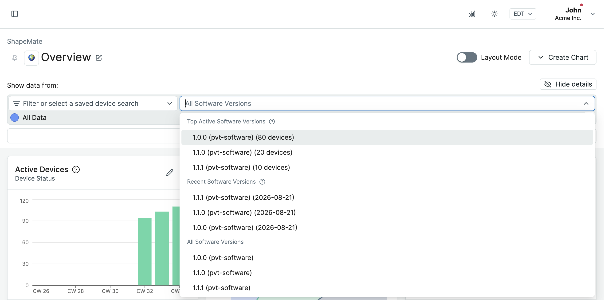
To filter the data by Software Version, use the right-side dropdown.
This filter acts on the Software Version that was running on the Device at the time the data was captured. This is different from the "Current Software Version" filter in the Devices filter, which filters Devices based on their current Software Version.
This filter is most useful in combination with the "By Cohort or Software Version" rollup option of Metric charts and Device Vitals charts, to see a per-Software Version breakdown in each chart.
Filtering by historic OS Version (Android only)
To filter the data by the historic
Android OS / android-build Version,
you can select one or more Software Versions from the Software Version dropdown
as normal. For Android projects, the dropdown will only show the Android OS
Versions. This is because all data collected from Android devices (monitoring,
debugging and log data) is attributed to the android-build version and not to
the app versions. Memfault has future plans to extend this coverage and
attribute these data points also to the versions of the apps running at the time
of the collection of the data (e.g. reboot when app version X was running).
The historic OS Version is the Android OS Version that was running on the Device at the time the data was captured. This is different from the "Current Software Version" filter in the Devices filter, which filters Devices based on their current Software Version.
The distinction between OS Version and Software Version (individual app versions) is only relevant for Issue/Trace Charts and only for Android projects. A Trace from a crashing Android app will have the app's Software Version as well as the Android OS version associated with it. Using the OS Version filter, you can filter the Issue/Trace Charts by Android OS Version, regardless of the (app) Software Versions of the aggregated Traces.
To see crashes of a certain app version, you can create an Issue Chart using the Software Version filter on the Issue Search Page.
Comparison Mode
To compare the data from different sets of Devices, click the Add comparison
button in the filters section of a dashboard:
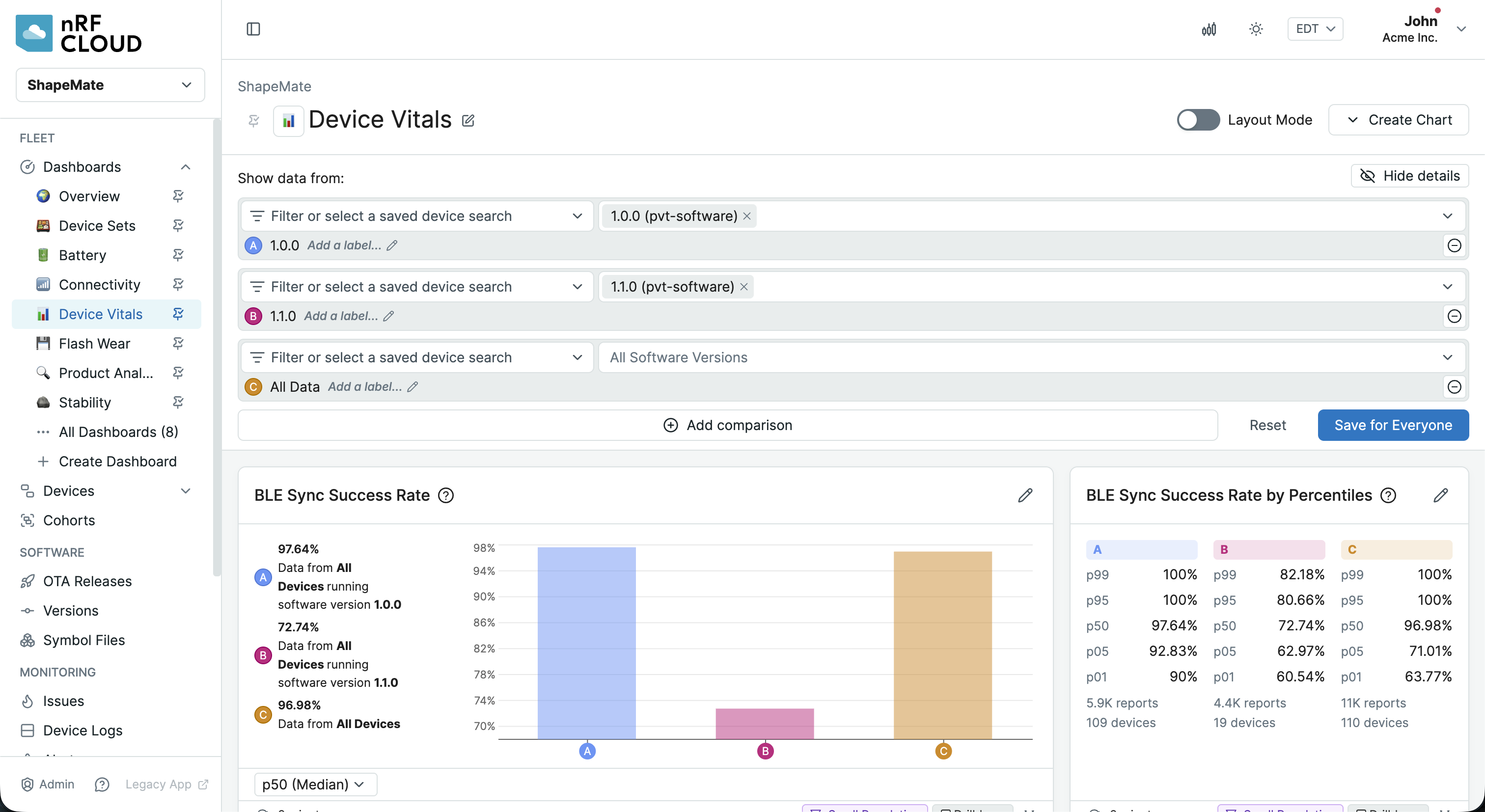
Some chart types have Count and Sum aggregations, which produce absolute
values based on the number of applicable Devices. This can be misleading when
comparing different Device populations. See
chart normalization for more information.
After adding or removing comparisons, save them with the Save for Everyone
button, or restore the saved state by clicking Reset.
Filter Labels
By default, each set of filters you add in Comparison Mode is represented by a color and an auto-generated description. This is displayed in chart legends, tooltips, and the filter rows.
You can apply a custom label instead by clicking on "Add a name..." in each
filter row. Labels must be unique within a dashboard and can be up to 100
characters long. Like comparison filters, changes to labels are only saved when
you click the Save for Everyone button.

Note: labels are contained within a dashboard and are not reusable across dashboards or other search pages.
Drilldown
Some charts that have a Drilldown badge on them can be clicked on sections of the chart (and sometimes also on labels) to dig into the information behind the clicked section. For example, clicking on a section in a Reboots chart will go to a filtered-down list of Devices that make up the data for that interval and reboot reason.
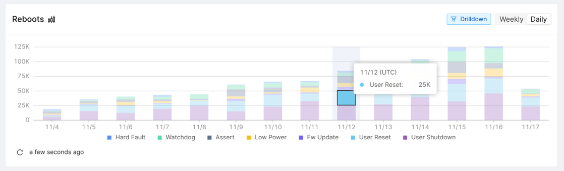
Clicking on this section will give you a list of devices that rebooted on November 12th due to a user reset.
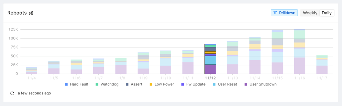
Clicking on the label will give you a list of devices that rebooted on November 12th for any reason.
Chart Normalization
Chart Normalization converts absolute values such as number of incidents, sums, and counts to relative values "per 1,000 devices". This helps understanding real trends when you are comparing these values between populations of different sizes (e.g. comparing devices from a large production Cohort against those from a smaller test Cohort) or when the population size changes over time (e.g. new devices being activated continuously or changing Fleet Sampling resolutions).
Toggling Chart Normalization on/off
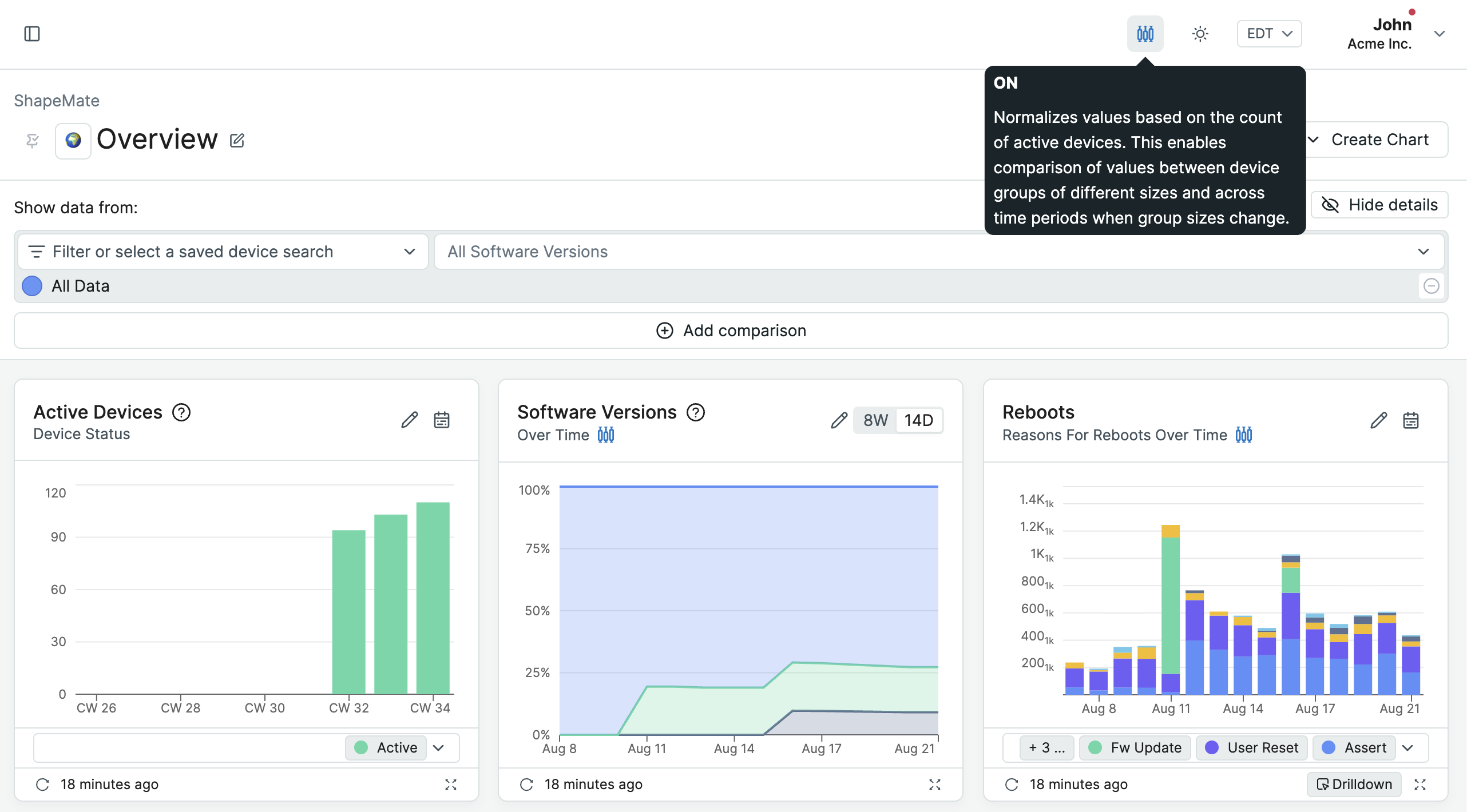
This is a global setting for all browser tabs that you can toggle in the top
right corner of the page, next to the timezone selector. Each applicable chart
has a small button  that toggles the setting globally as
well.
that toggles the setting globally as
well.
Charts that support Normalization
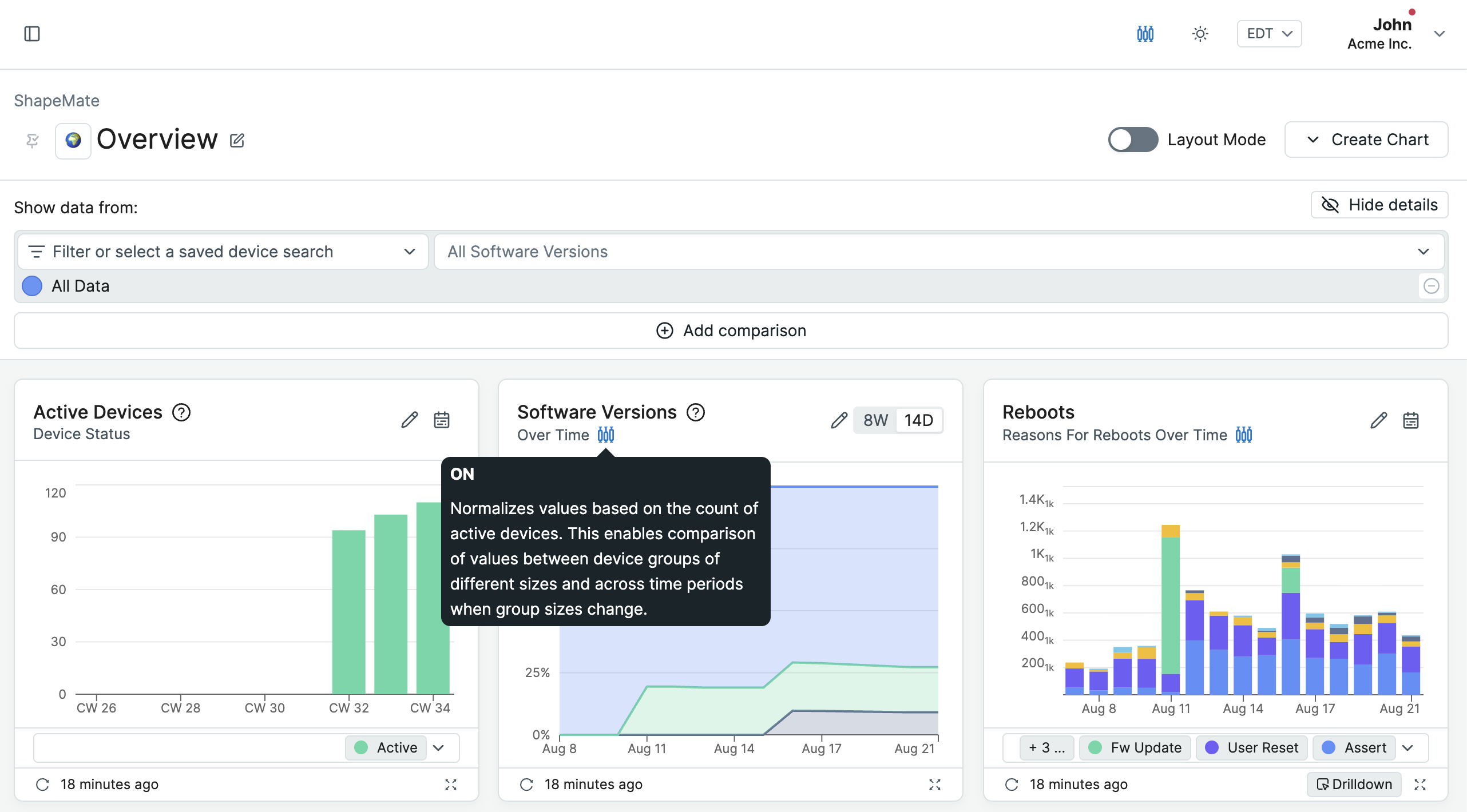
Chart Normalization is supported on all charts that show absolute values such as number of incidents, sums, or counts. For values that are not affected by the population size (e.g. minimum, maximum, average) Chart Normalization is unavailable and would not have any effect.
Population and Normalized Values
The population is the number of devices that contributed to the value. Usually, this is based on the number of Active Devices during the corresponding time period.
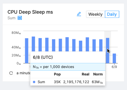
Normalized values are depicted with a 1k subscript. Examples:
- 42₁ₖ means "42 per 1,000 devices"
- 3K₁ₖ means "3,000 per 1,000 devices".
To calculate the normalized value () from the absolute value () and a given population () use the following formula:
For the values in the screenshot above that translates to:
Examples of Chart Normalization
Comparing Values Between Cohorts
If you're interested in seeing an all-time comparison between multiple Cohorts or multiple Software Versions, use Metric Charts by Cohort or Software Version.
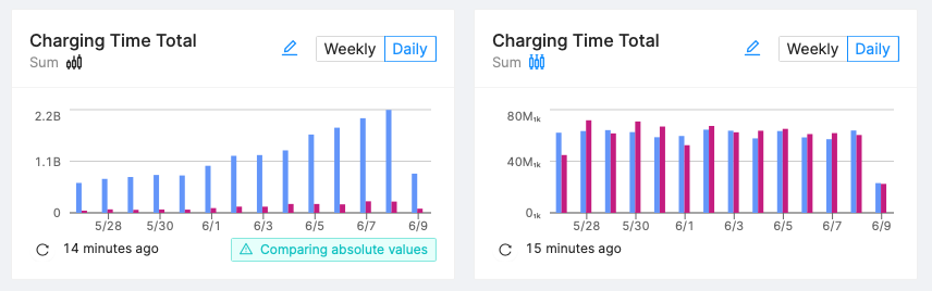
Without Chart Normalization (left): Cohort A (blue) reported more than 10x the duration spent charging compared to Cohort B (purple). But in reality, both cohorts have a growing population with Cohort A consisting of 13,000 devices and Cohort B of only 1,000 devices.
Relatively speaking, the time spent charging stayed the same at about 60M₁ₖ.
Population Changes
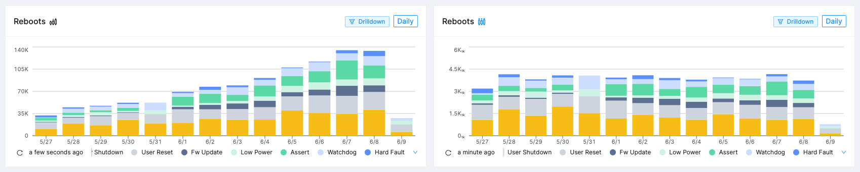
Two weeks ago, the fleet reported 36K reboots per day steadily growing towards 130K daily reboots. It looks like the devices started to reboot more often. But in reality, the population grew from 10K devices to 36K devices during the same time span (as more people unpacked devices).
Relatively speaking, the number of reboots stayed the same at about 3.6₁ₖ.
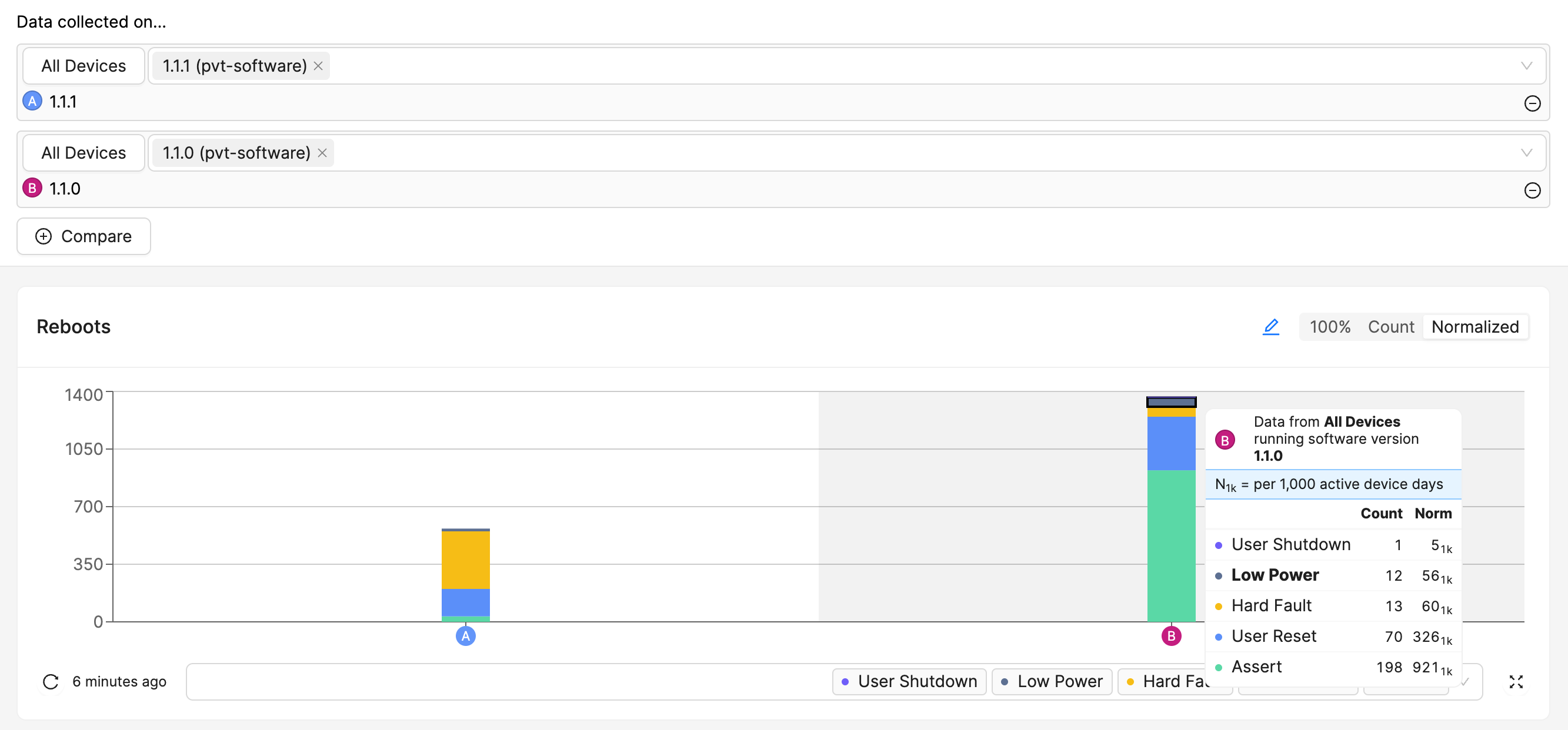
Normalization by Active Device Days
While normalizing by the population size is useful for comparing absolute values over time, it does not account for the fact that some devices may have been active for longer periods of time than others. To account for this, you can normalize by the total number of active-device-days when comparing reboots over all time by population aggregation. This will give you a value that represents the number of reboots per 1,000 device days.